
Component Libraries: Components
IMPORTANT NOTE: If you are starting a new project use SDC for Drupal 9, or SDC in core for Drupal +10.1.
CL Components lets you declare Drupal components that you can import and render in your Drupal site.
The Single Directory Components
CL Components implements the single directory component approach. Everything you need for your component is in a single directory.
This includes: my-component.twig, my-styles.css, my-behaviors.js, my-component.php, etc. If it affects how your component renders, it's in that directory
This way your components are easier to find, don't have unaccounted code on some other place, and can be easily copy&pasted.
This module does not depend on Storybook in any way.What do you mean by "component"?
In this context, a component is the combination of:
- A regular Twig template.
- Metadata describing the input data the template accepts (the
metadata.jsonfile). - Optional JavaScript.
- Optional Styles.
Check out these example components for more details.
A component then needs to be embedded in your Drupal templates, otherwise it just sits there waiting to be used. (Drupal templates are the templates that get used by naming them with the correct convention, like node--article--card.twig.html)
In this context, a component is not: a type of a block plugin (like Component and Decoupled Blocks modules), a Twig template by itself (like the Components module). These are more comparable to the JS Widgets modules.
This module treats components in a very similarly to the (brilliant) Single File Components module, but doesn't take an opinion on how to embed components inside your Drupal templates, and with a more familiar syntax for Drupal developers.
The mission of CL Components is to make Drupal theming simpler by introducing Single Directory Components. Front-end devs have enough on their plate, they shouldn't need to know the internals of Drupal.How to create a component
A component is any directory in your Drupal install that contains a metadata.json. This folder must also contain at least a my-component.twig template. It is advised to create a css and js directory for your stylesheets and JS scripts.
Learn more about creating a component in the documentation.
You will need to let Drupal know where to start scanning for components (including subdirectories). You can add as many locations as you need in the settings page (admin/config/user-interface/cl-components).
How to render a component
In Drupal there are two main ways to render some HTML, via a render array, and via Twig.
Via render array
See the documentation.
Via Twig templates
Go to the template where you want to place your component, and embed/include it.
Easy to embed
Embed your component like you always embedded your template.
You can use the familiar include/embed with the component's machine name
Libraries included
JS and CSS files inside the component folder will be included during render.
For caching reasons you can include cl_components/all in your theme. This library includes the CSS and JS for all the components.
Props & slots
Components can take structured data input via props, or any markup via slots.
Props and slots are integrated in Drupal templates using the standard include, extend, and embed from Twig.
With the traditional syntax: include or embed
Just provide the machine name of the template of the component. CL Components add the CSS & JS if needed.
Example of how to embed a button:
{{ include('my-button--primary', {
  text: 'Click Me',
  iconType: 'external'
}) }}
Example of how to render a slot in a card component:
{% embed 'my-card' with {
  header: label
} %}
  {% block card_body %}
    {{ content.field_media_image }}
    <div class="summary">
      {{ content|without('field_media_image') }}
    </div>
    {% include 'my-button' with { text: 'Like', iconType: 'like' } %}
  {% endblock %}
{% endembed %}
See the documentation for more details.
Main focus on the front-end developer experience
CL Components incorporates a variety of helpers to help front-end developers understand what is going on, and what is their next step. Examples of this focus are: the debug mode, the component audit, the additional DOM comments, the simplified embed syntax, etc.
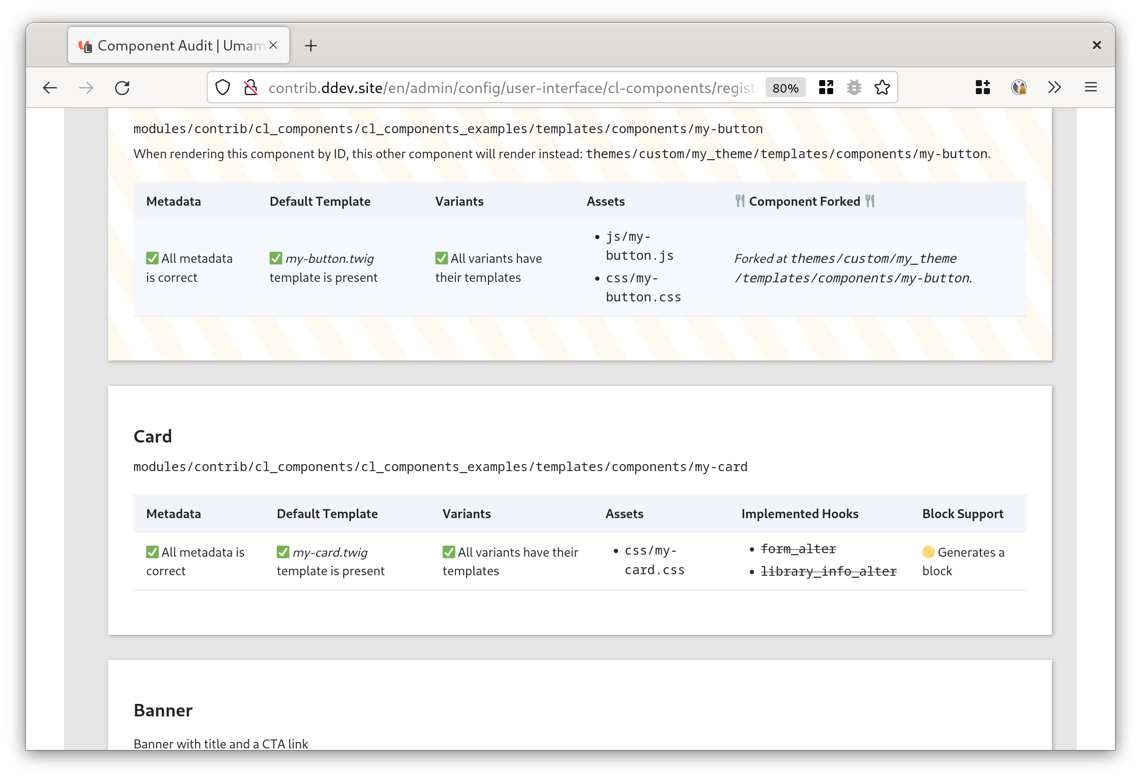
The component Audit Page tells you all you need to know about each component
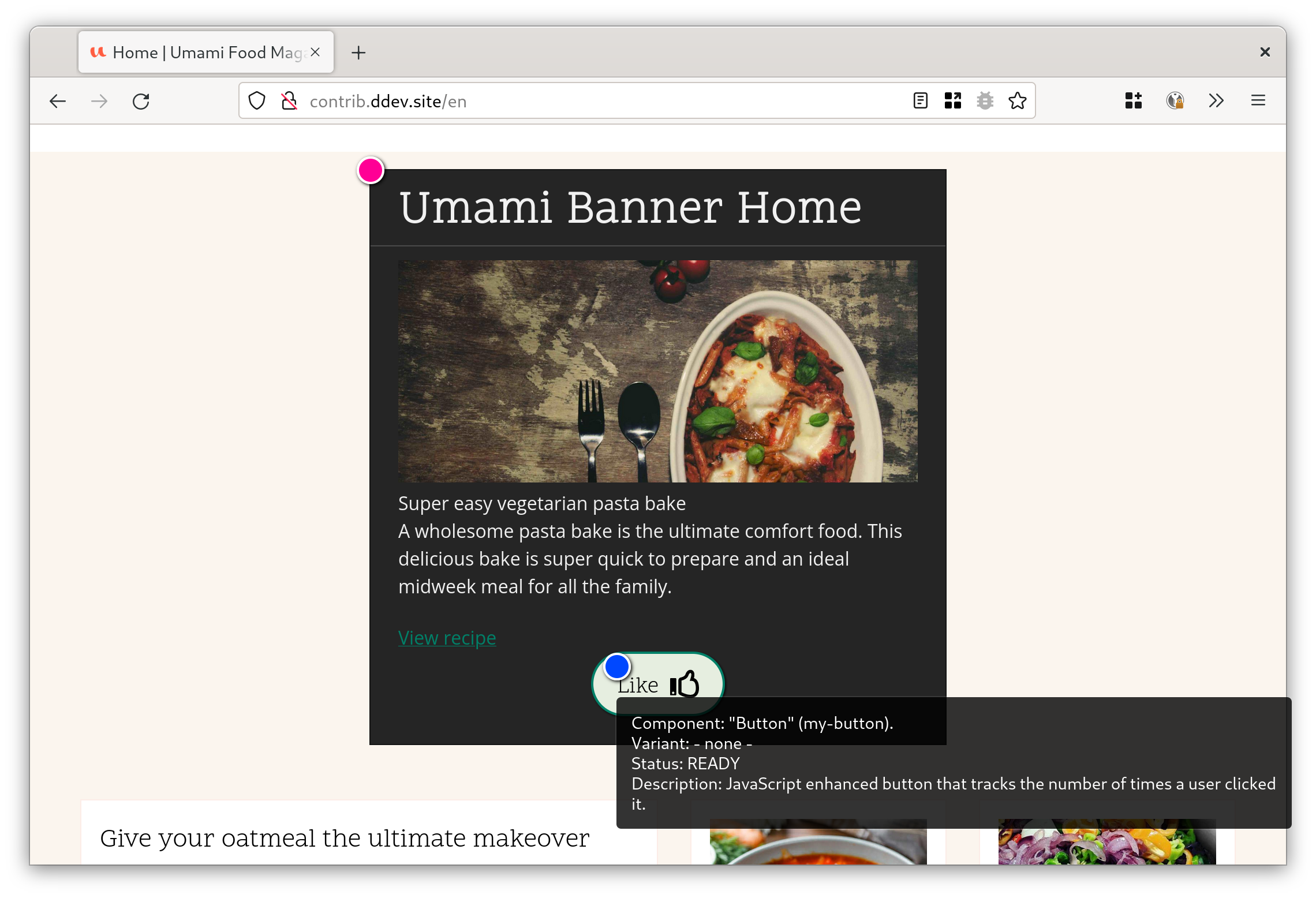
Enable the debug mode to understand which parts of your page are which component in a visual way. Tip
leverage the No Markup module in order to easily clean out wrapping field markup from the {{ content.field_name }} in your templates. See more info on why avoiding {{ content.field_name|render|striptags }} and {{ node.field_name[0].getValue }} is important.
CL Components Ecosystem
CL Components is integrated with the block system, wysiwyg, fields API, etc. Check out the extending modules:
Place components editorially with CL Block Scaffold components with CL Generator Build a component library with CL Server Let editors choose the component with CL Style Selector Field Improve development experience with CL Devel
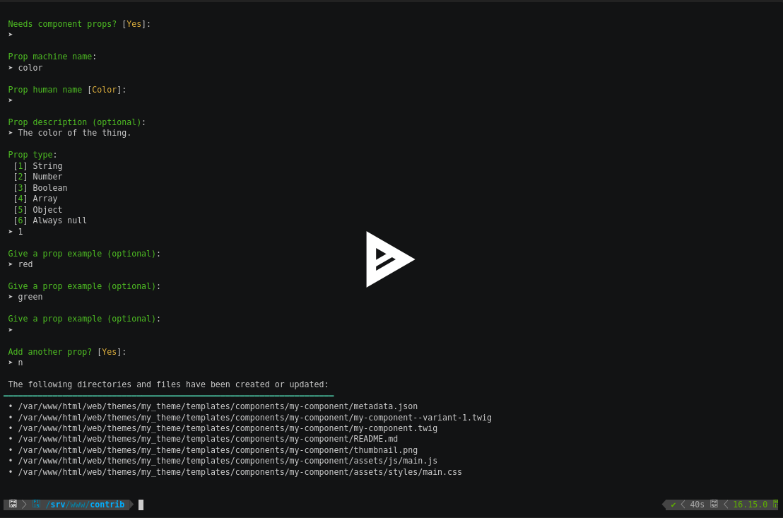
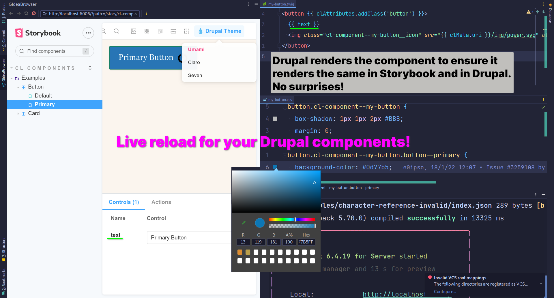

Now you can build a component library... if you want
Now that we have components we can build a component library. Thanks to CL Server this is super easy!
I recommend Storybook, but others are great options as well.
💧Component Libraries: Server Drupal module
📚 Storybook Drupal Addon
Depends on
Dependencies of the latest stable release
No dependencies recorded for this project.
Required by
Tracked projects that depend on this one
No tracked projects depend on this one yet.